Button Widgets
A brief look at some of the Button Widgets.
Normal Buttons
A button (the Gtk.Button widget) is a widget that emits a signal when clicked
on. We've almost seen all there is to see of the button widget . It's
pretty simple, as seen from previous examples.
There is more than one way to create a button:
-
You can use the
Gtk.Button()creates a blank button. It is then up to you to pack labels and graphics into this button, usually using theadd()callback. -
Gtk.Button.new_with_label()andGtk.Button.new_with_mnemonic()creates a button containing a textual label. -
Gtk.Button.new_with_mnemonic()creates a button containing a textual label containing a mnemonic. Mnemonics are underlined characters in the label, used for keyboard navigation. Mnemonics are created by providing a string with an underscore before the mnemonic character, such as "_File".
Here's an example of using Gtk.Button.new() to create a button with an image
and a label in it. I've broken up the code to create a box from the rest so you
can use it in your programs. There are further examples of using images later
in the tutorial.
/* Create a new box with an image and a label packed into it
 * and return the box. */
static Gtk.Box xpm_label_box(string xpm_filename, string label_text ) {
  Gtk.Box box;
  Gtk.Label label;
  Gtk.Image image;

  /* Create box for image and label */
  box = new Gtk.Box(Gtk.Orientation.HORIZONTAL, 0);
  box.set_border_width(2);

  /* Now on to the image stuff */
  image = new Gtk.Image.from_file(xpm_filename);

  /* Create a label for the button */
  label = new Gtk.Label(label_text);

  /* Pack the image and label into the box */
  box.pack_start(image, false, false, 3);
  box.pack_start(label, false, false, 3);

  image.show();
  label.show();

  return box;
}

class ButtonWindow : Gtk.Window {

  Gtk.Button button;
  Gtk.Box box;

  /* Our usual callback function */
  void callback (string data) {
    stdout.printf("Hello again - %s was pressed\n", data);
  }

  public ButtonWindow () {

    this.set_title("Pixmap'd Buttons!");

    /* It's a good idea to do this for all windows. */
    this.destroy.connect( ()=> { Gtk.main_quit(); } );

    this.delete_event.connect( ()=> { return false; } );

    /* Sets the border width of the window. */
    this.set_border_width(10);

    /* Create a new button. */
    this.button = new Gtk.Button();

    /* Connect the "clicked" signal of the button to our callback. */
    this.button.clicked.connect( ()=> { this.callback("cool button"); });

    /* This calls our box creating function. */
    this.box = xpm_label_box("img.png", "cool button");

    /* Pack and show all our widgets. */
    this.box.show();

    this.button.add(box);

    this.button.show();

    this.add(button);

  }

  public static int main (string[] args) {

    Gtk.init(ref args);

    var buttonwindow = new ButtonWindow();
    buttonwindow.show();

    Gtk.main();

    return 0;
  }

}
The xpm_label_box() function could be used to pack images and labels into any
widget that can be a container.
The signals that we are usually interested in when programming buttons are:
-
button_press_event- emitted when a button (typically from a mouse) is pressed. This is notGtk.Button-specific signal, it may be emitted by anyGtk.Widget. -
button_release_event- emitted when a button (typically from a mouse) is released. This is notGtk.Button-specific signal, it may be emitted by anyGtk.Widget. -
clicked- emitted when theButtonhas been activated (pressed and released). -
enter_notify_event- emitted when pointer enters theButton. This is notButton-specific, it is a signal that may be emitted when the pointer enters anyGtk.Widget. -
leave_notify_event- emitted when pointer leaves theButton. This is notButton-specific, it is a signal that may be emitted when the pointer enters anyGtk.Widget.
Toggle Buttons
Toggle buttons are derived from normal buttons and are very similar, except they will always be in one of two states, alternated by a click. They may be depressed, and when you click again, they will pop back up. Click again, and they will pop back down.
Toggle buttons are the basis for check buttons and radio buttons, as such, many of the calls used for toggle buttons are inherited by radio and check buttons. I will point these out when we come to them.
We use the following constructors to instantiate a Gtk.ToggleButton
new Gtk.ToggleButton();
new ToggleButton.with_label(string label)
new ToggleButton.with_mnemonic(string label)
As you can imagine, these work identically to the normal button widget calls.
The first creates a blank toggle button, and the last two, a button with a label
widget already packed into it. The _mnemonic() variant additionally parses the
label for '_'-prefixed mnemonic characters.
To retrieve the state of the toggle widget, including radio and check buttons,
we use a construct as shown in our example below. This tests the state of the
toggle button, by accessing the active field of the toggle widget's structure.
The signal of interest to us emitted by toggle buttons (the toggle button,
check button, and radio button widgets) is the "toggled" signal. To check
the state of these buttons, set up a signal handler to catch the toggled signal,
and access the structure to determine its state.
The following example shows how to create and use toggle buttons:
public class Application : Gtk.Window {

  private void toggled (Gtk.ToggleButton button) {
    stdout.printf("%s: %s\n", button.label, button.active ? "true" : "false");
  }

  public Application () {

    // Set Window Attributes
    this.title = "Toggle Buttons";
    this.window_position = Gtk.WindowPosition.CENTER;
    this.destroy.connect(Gtk.main_quit);
    this.set_default_size(350, 70);
    this.set_border_width(10);

    // Create a VBox to pack the radio buttons in.
    Gtk.Box box = new Gtk.Box(Gtk.Orientation.VERTICAL, 0);
    this.add (box);

    // The buttons:
    Gtk.ToggleButton button1 = new Gtk.ToggleButton.with_label("Button 1");
    box.pack_start (button1, false, false, 0);
    button1.toggled.connect(toggled);

    Gtk.ToggleButton button2 = new Gtk.ToggleButton.with_label("Button 2");
    box.pack_start (button2, false, false, 0);
    button2.toggled.connect(toggled);

  }

  public static int main (string[] args) {
    Gtk.init(ref args);

    Application app = new Application();
    app.show_all();
    Gtk.main();
    return 0;
  }
}
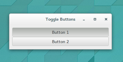
Whe compiled, we get a window similar to the following:

To get and set the state of a Gtk.ToggleButton, Gtk.RadioButton, and
Gtk.CheckButton, we can use the active property of these widgets. It is a
boolean property, which is true when the button is active (depressed) and
false otherwise.
Check Buttons
Check buttons inherit many properties and functions from the the toggle buttons
above, but look a little different. Rather than being buttons with text inside
them, they place a discrete Gtk.ToggleButton next to a widget, (usually a
Gtk.Label).
The Gtk.CheckButton constructors are similar to those for the Gtk.ToggleButton:
Gtk.CheckButton()

Gtk.CheckButton.with_label(string label);

Gtk.CheckButton.with_mnemonic(string label);
The Gtk.CheckButton.with_label(string label) constructor creates a check
button with a label beside it.
Checking the state of the check button is identical to checking that of the
toggle button, i.e. via the active property of the widget.
Radio Buttons
Radio buttons (implemented by the Gtk.RadioButton widget) are similar to check
buttons except they are grouped so that only one may be selected/depressed at a
time. This is good for places in your application where you need to give the
user a choice from a short list of options.
A single radio button performs the same basic function as a Gtk.CheckButton. It
is only when multiple radio buttons are grouped together that they become a
different user interface component in their own right. Every radio button is a
member of some group of radio buttons. When one is selected, all other radio
buttons in the same group are deselected.
Creating a new radio button is done with one of these constructors:
// Create a new radio button, and add it to group ().
Gtk.RadioButton(GLib.SList? group);

// Create a new radio button, adding it to the same group
// as radio_group_member
Gtk.RadioButton.from_widget(RadioButton? radio_group_member);

// Create a new RadioButton with a text label and add it to group.
Gtk.RadioButton.with_label(GLib.SList? group, string label);

// Create a new RadioButton with a text label, adding it to the same group
// as radio_group_member.
Gtk.RadioButton.with_label_from_widget(RadioButton? radio_group_member, string label);

// Create a new RadioButton containing a label, adding it to the same group
// as group.
Gtk.RadioButton.with_mnemonic (GLib.SList? group, string label);

// Create a new RadioButton containing a label.
public RadioButton.with_mnemonic_from_widget (RadioButton? radio_group_member, string label);
You'll notice the extra argument to these calls. Gtk.RadioButtons require a
group to perform their duty properly. The call to create the first Gtk.RadioButton
should be passed null as the first argument. In subsequent calls, the group
you wish to add this button to should be passed as an argument.
The _from_widget() variants of the creation functions allow you to shorten
further creation calls. This form is used in the example below.
It is also a good idea to explicitly set which button should be the default depressed button.
This is described in the section on toggle buttons, and works in exactly the same way. Once the radio buttons are grouped together, only one of the group may be active at a time. If the user clicks on one radio button, and then on another, the first radio button will first emit a "toggled" signal (to report becoming inactive), and then the second will emit its "toggled" signal (to report becoming active).
The following example creates a radio button group with three buttons.
public class Application : Gtk.Window {

  private void toggled (Gtk.ToggleButton button) {
    stdout.printf("%s\n", button.label);
  }

  public Application () {

    // Set Window Attributes
    this.title = "Radio Buttons";
    this.window_position = Gtk.WindowPosition.CENTER;
    this.destroy.connect(Gtk.main_quit);
    this.set_default_size(350, 70);

    // Create a VBox to pack the radio buttons in.
    Gtk.Box box = new Gtk.Box(Gtk.Orientation.VERTICAL, 0);
    this.add (box);

    // The buttons:
    Gtk.RadioButton button1 = new Gtk.RadioButton.with_label_from_widget (null, "Button 1");
    box.pack_start (button1, false, false, 0);
    button1.toggled.connect(toggled);

    Gtk.RadioButton button = new Gtk.RadioButton.with_label_from_widget (button1, "Button 2");
    box.pack_start (button, false, false, 0);
    button.toggled.connect (toggled);

    button = new Gtk.RadioButton.with_label_from_widget (button1, "Button 3");
    box.pack_start(button, false, false, 0);
    button.toggled.connect(toggled);
    button.set_active (true);

  }

  public static int main (string[] args) {
    Gtk.init(ref args);

    Application app = new Application();
    app.show_all();
    Gtk.main();
    return 0;
  }
}
Link Button
A Gtk.LinkButton is a Gtk.Button with a hyperlink, similar to the one used
by web browsers, which triggers an action when clicked. It is useful to show
quick links to resources.
A link button is created by calling either
Gtk.LinkButton(string uri)or
Gtk.LinkButton.with_label(string uri, string label)If using the former, the URI you pass to the constructor is used as a label for the widget.
The URI bound to a Gtk.LinkButton can be set and retrieved specifically using
the property Gtk.LinkButton.uri.
By default, Gtk.LinkButton calls Gtk.show_uri() when the button is clicked.
To override this behaviour, you can connect to the activate_link signal and
stop the propagation of the signal by returning true from the handler.
The following example creates a single link button:
public class Application : Gtk.Window {

  public Application () {
    // Prepare Gtk.Window:
    this.title = "My Gtk.LinkButton";
    this.window_position = Gtk.WindowPosition.CENTER;
    this.destroy.connect (Gtk.main_quit);
    this.set_default_size (350, 70);

    // The button:
    Gtk.LinkButton button = new Gtk.LinkButton.with_label ("https://developer.gnome.org/gtk3/stable/index.html", "GTK+ 3 Reference Manual");
    this.add (button);
  }

  public static int main (string[] args) {
    Gtk.init (ref args);

    Application app = new Application ();
    app.show_all ();
    Gtk.main ();
    return 0;
  }
}
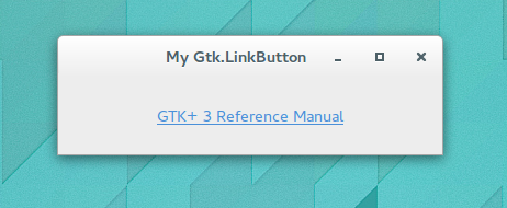
When compiled an run, it should create a window similar to the following:

References and Further Reading
-
The GTK 3 Reference Manual : Buttons and Toggles. [Online] Available from: https://developer.gnome.org/gtk3/stable/ButtonWidgets.html [Accessed 13th November 2014]
-
The Python GTK 3 Tutorial : Button Widgets. [Online] Available from: http://python-gtk-3-tutorial.readthedocs.org/en/latest/button_widgets.html [Accessed 13th November 2014]
-
Documentation on Gtk.LinkButton in Valadoc [Online] Available from: http://valadoc.org/#!api=gtk+-3.0/Gtk.LinkButton [Accessed 13th November 2014]